Announcement

Collapse
No announcement yet.
X
 
  • Filter
  • Time
  • Show
Clear All
new posts

  • Bourke To Birdsville

    Apparently people are only seeing 1 photo so creating a new thread to hopefully delete the other one.

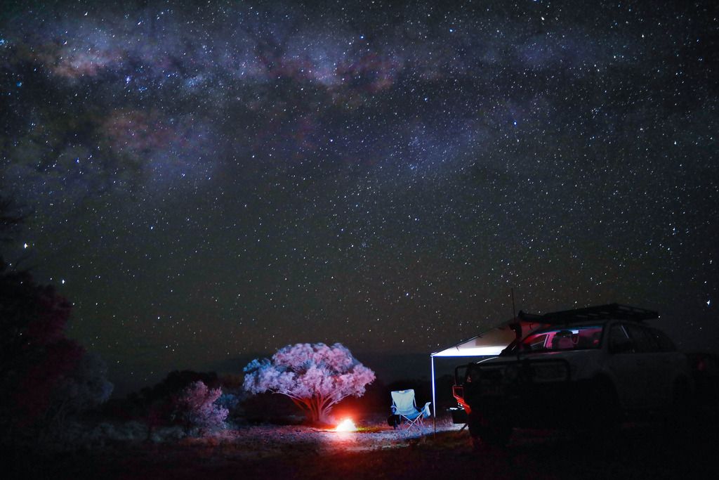
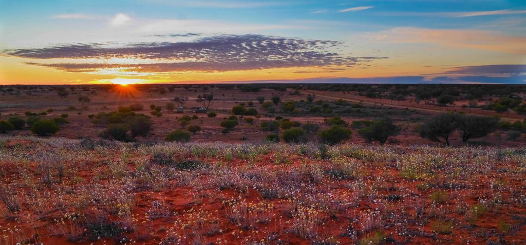
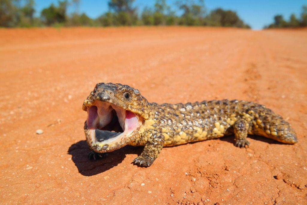
    Some photos from part of my recent trip to the top end. These ones are all between Bourke and Birdsvile.

    Click image for larger version

Name:	Outback Camp.jpg
Views:	68
Size:	163.3 KB
ID:	432787


    Click image for larger version

Name:	Outback Sunrise.jpg
Views:	73
Size:	250.0 KB
ID:	432788

    Click image for larger version

Name:	Shingleback.jpg
Views:	75
Size:	113.7 KB
ID:	432789

    I saw that many postcards etc with rubbish photos on them. Do any of these seem postcard/poster worthy to the neutral eye?
    Sony A7rii
    https://www.redbubble.com/people/Tod...ortfolio?asc=u

  • #2
    That works better. I love the second one with the wildflowers and sunset or rise? Beautiful pastel colors!

    The top one has potential I think but needs a bit of a tweak to balance it up a little more. If you are able to get a bit more detail out of the vehicle and perhaps rotate the image a whisker clockwise then possibly crop a little out of the sky.

    The lizard is a great pose and subject but I see it as a bit on the soft side. The focus is on the back of the mouth and the attention is all on the tongue.

    Cheers.

    Comment


    • #3
      Thanks Greg. That one was a sunrise. Walked up the hill about 200m from camp and stood there watching it.

      I agree with your comments re #3. Probably used too narrow an aperture.

      Re #1 - unsure what you mean by crop the sky?

      Thanks for the comments.

      I've also got this one of the Shingleback but no tongue

      Last edited by Toddyh; 05-10-2016, 10:54 AM.
      Sony A7rii
      https://www.redbubble.com/people/Tod...ortfolio?asc=u

      Comment


      • #4
        I like this shot of the Shingleback much better. This would make a fine postcard.

        I've edited your night shot as best I can with a small file to show how I think it balances better as an image.

        Click image for larger version

Name:	Toddy 1.jpg
Views:	57
Size:	157.5 KB
ID:	432803

        Comment


        • #5
          Thanks Greg. I really wanted the the chair and fire as the focal point. That's why I was happy with the dark car. Thanks again for the feedback.
          Sony A7rii
          https://www.redbubble.com/people/Tod...ortfolio?asc=u

          Comment


          • #6
            What a wonderful night that must have been, Toddy!

            I think the big starry sky is stunning and I would be processing it for a bit more drama. I had a quick play and there is more detail and colour there (did you shoot raw?)

            The bright purple/magenta of the tent light seems odd and overpowering to me.

            Just wondering if you needed it at all as the fire would probably have provided enough warm light for an atmospheric photo with maybe a bit of light painting with a torch to highlight some details. That chair is really bright and demanding attention (I know you wanted it to do that), but seems to be facing away from the fire rather than drawing more attention to it

            I think the sky, tree and fire are the 'natural' hero elements here and the other things could have been suggested ?

            The second lizard is great and certainly Post Card worthy

            Sunrise equally so with a bit more processing to lift the foreground a bit. Composition, light and timing are great - maybe just lighten the flowers a bit?

            What a stunning place to wake up in - I love that country

            TFS
            Alan

            D7500 | iPhone XS Max | Mac

            Flickr Instagram

            Comment


            • #7
              Thanks for the feedback Alan. I tried previously facing the chair towards the fire but it looked uninviting. The chair facing the camera seemed to say 'come have a seat'.

              How's this?


              Last edited by Toddyh; 05-10-2016, 03:52 PM.
              Sony A7rii
              https://www.redbubble.com/people/Tod...ortfolio?asc=u

              Comment


              • #8
                Love stumpy tail version #2 ... very much like your landscape shot as well ... love the wild flowers and the red earth
                Barb
                "If you change the way you look at things ........ the things you look at change"

                Comment


                • Toddyh
                  Toddyh commented
                  Editing a comment
                  Thanks Barb

              • #9
                Yes, I like how you have reduced the brightness of the chair and worked on the stars. The colours of the sky and the light match. What I sometimes do is include myself in the photo, (self timer) so that the chair isn't empty, (I just couldn't imagine myself sitting in that chair, facing a bright light, while a welcoming fire and tree with a stunning night sky went off behind me)

                I also like what you have done with the dawn - that foreground really glows now, but it still looks natural to me. And that crop is great - very nice Divides the photo up into three almost equal layers so they all share the spotlight.

                Thanks for giving my suggestions a go

                I'm sure others will have equally valid ones.

                Cheers

                Postcard material for sure

                Click image for larger version

Name:	Bourke PC.jpg
Views:	67
Size:	238.8 KB
ID:	432847
                Last edited by Alan; 05-10-2016, 05:51 PM.
                Alan

                D7500 | iPhone XS Max | Mac

                Flickr Instagram

                Comment


                • #10
                  Thanks Alan again for the comments and for the nice border.
                  Sony A7rii
                  https://www.redbubble.com/people/Tod...ortfolio?asc=u

                  Comment

                  Working...
                  X