Announcement
Collapse
No announcement yet.
X
-
Been playing with some mono stuff lately
__________________
> Motorhome travels outback eastern Australia much of each year
> recent images at http://www.flickr.com/photos/ozzie_traveller/sets/Tags: None
-
Thank you for posting some interesting images and allowing it to be constructively criticised... by hacks like me. :-)
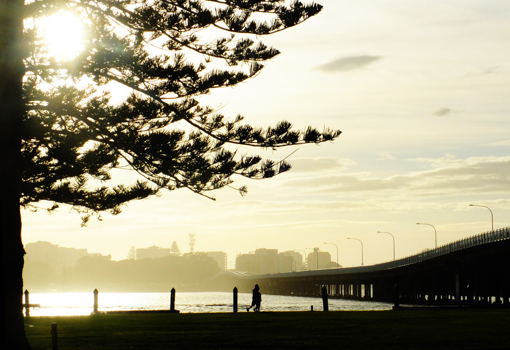
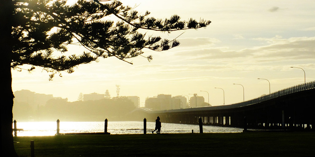
#1 The toned down hues the first brings out the layers and highlights that bridge leading into the mist nicely without the distraction of colour.
The contrast works well.. II especially like how you have cropped it so the tree adds balance on the left to the darkness of the bridge on the right. The people add a nice sense of size and dynamics.
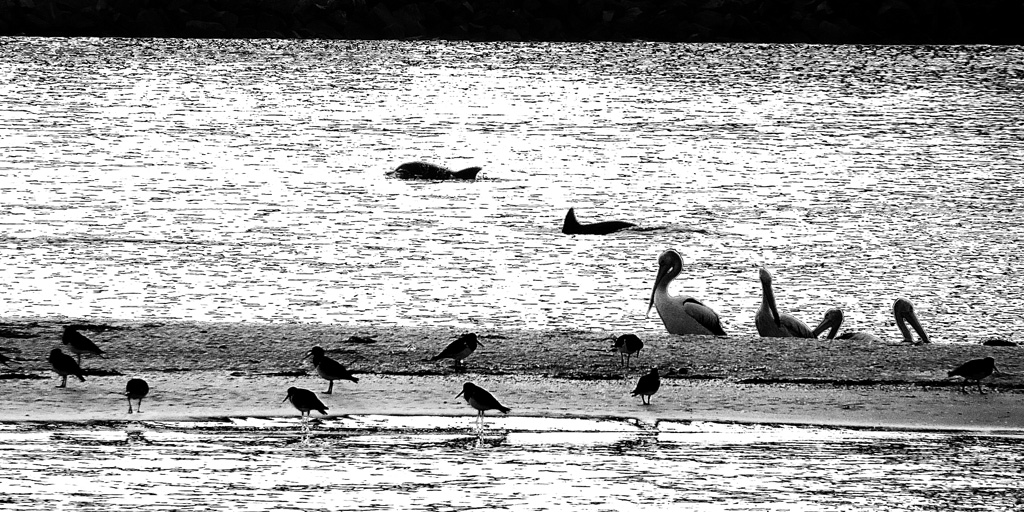
#2 Always nice to have animal diversity in an image and to capture dolphins with birds is wonderful. I get the sense of how lovely this place was.
I always find it surprisingly tricky to get a pleasant composition when faced with situations like this, as the animals are higgledy piggeldy and refuse to stay in nice diagonals, nor do they put the most important subject on a thirds intersection or all face the right way. I think cutting out the three headless waders on the left would strengthen the composition a little and help balance the shot.
I would also like to see a little less contrast. The water seems to have lost some of its fluidity.
I hope my feedback is helpful and would love to know if you or anyone else disagrees.
Comment
-
With #1 I'll simply concur with Jo's remarks and add a suggestion for a crop. For me the image is, from a composition viewpoint, about the tree, the people and finally the bridge leading the eye into the city. It works a treat. But I'd suggest maybe a slight crop off the top to just above the longest branch. The bright sun distracts slightly and I feel the image might be strengthened by concentrating on the other compositional elements. Hope this makes some sense, it's all subjective.
#2. Hmmm...just not working for me but I think that's down to the processing as much as anything, and that's just personal taste. It appears harsh in a scene I'd view as tranquil, If you like it then please ignore. Can't think of a suggestion as to how I'd process it myself ... so, umm...yeah
Agree with Jo re removing the headless waders but on my screen they're on the left! -----------------------------------------------------
Question everything ~ Christopher Hitchins
Comment
-
__________________
> Motorhome travels outback eastern Australia much of each year
> recent images at http://www.flickr.com/photos/ozzie_traveller/sets/
Comment
-
nice treatment of thse two. the crop of the first one makes a big difference imho, the bright stuff at the top led the viewer away from you image but the crop sorts that.
the second image is well and truly on the right track but I think a minimalist composition would have worked better. consider if you just had the 2 dolphins and the rest of the frame the water like that and you selling that shot for thousands. not that you had the opportunity to go minimalist here but just saying..........Stephen Davey. Nikon Shooter
Comment


Comment