Announcement

Collapse
No announcement yet.

Includes seascape, panorama and travel photography

X
 
  • Filter
  • Time
  • Show
Clear All
new posts

  • Latest Travels

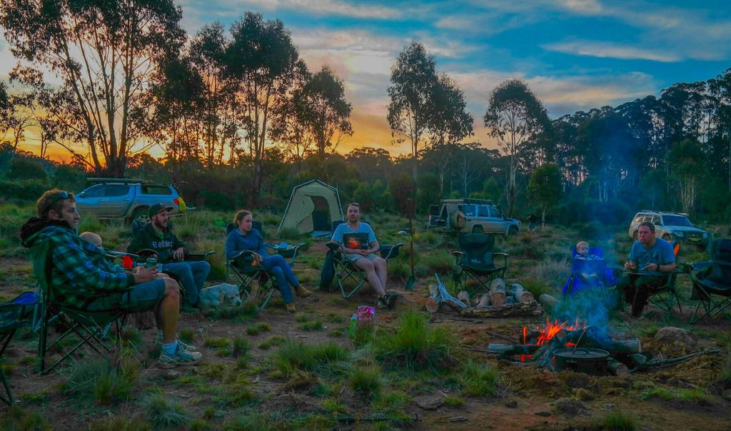
    Just thought I'd share a couple of images from my latest travels to the Victorian High Country.
    Click image for larger version

Name:	LrMobile2703-2016-0956644587674682934.jpeg
Views:	287
Size:	187.6 KB
ID:	420641


    Click image for larger version

Name:	LrMobile2803-2016-1040736131396810149.jpeg
Views:	97
Size:	103.1 KB
ID:	420642

    Click image for larger version

Name:	LrMobile2703-2016-0922644614383728446.jpeg
Views:	80
Size:	252.6 KB
ID:	420643
    Sony A7rii
    https://www.redbubble.com/people/Tod...ortfolio?asc=u

  • #2
    Edited the above on my phone. Had another go on the computer for (I think) better results.
    Click image for larger version

Name:	Persepctive-28.jpg
Views:	207
Size:	191.9 KB
ID:	420645


    Click image for larger version

Name:	Persepctive-43.jpg
Views:	176
Size:	128.7 KB
ID:	420646

    Click image for larger version

Name:	Persepctive-30.jpg
Views:	71
Size:	266.9 KB
ID:	420647
    Sony A7rii
    https://www.redbubble.com/people/Tod...ortfolio?asc=u

    Comment


    • #3
      Very relaxing. That last shot's a beauty!

      Comment


      • #4
        Looks like a hard life . Enjoy before it gets a bit chilly.

        Processing on #3 gives it a bit more life - but also looks slightly over cooked in the shadows - I like the sky - maybe somewhere between?

        I'd also consider cropping a bit off the bottom?( and in #1 also plus some off the top too for a more pano feel)

        Cheers
        Last edited by Alan; 29-03-2016, 09:19 PM.
        Alan

        D7500 | iPhone XS Max | Mac

        Flickr Instagram

        Comment


        • #5
          Thanks for the comments and suggestions guys.
          How's this?
          Click image for larger version

Name:	Persepctive-49.jpg
Views:	84
Size:	149.5 KB
ID:	420673


          Click image for larger version

Name:	Persepctive-50.jpg
Views:	90
Size:	243.2 KB
ID:	420674
          Sony A7rii
          https://www.redbubble.com/people/Tod...ortfolio?asc=u

          Comment


          • #6
            I think the first one was better the way it was?

            I prefer the crop on the second one.

            Hope you don't mind, but I had a play to try to coax out some more detail.

            Too many adjustments to list, but Shadows and Highlights, curves, reduce saturation in the blues, cyans and reds, dodge and burn. Slight 'Soft Light' Layer, slight Gaussian Blur around the edges.

            Might be too much

            Looks like a nice spot - I didn't notice the dog before

            Click image for larger version

Name:	Campfire adjust.jpg
Views:	64
Size:	381.7 KB
ID:	420678


            Alan

            D7500 | iPhone XS Max | Mac

            Flickr Instagram

            Comment


            • Toddyh
              Toddyh commented
              Editing a comment
              Thanks Alan. It looks good but seems to have lost some authenticity if you know what I mean.
              Would still like to know exactly what you did if you don't mind.

            • Alan
              Alan commented
              Editing a comment
              I do know what you mean - but also consider that the human eye compensates for varying/contrasting light levels and I suspect your first photo may not represent exactly the light levels you remember? I was just trying to address the unbalance in what the camera captured as to what it looked like at the time.

              I can't remember all the micro adjustments, but the major ones were what I described. I did duplicate the layer and selected only the foreground and mid ground to work on, as I thought the sky was fine. After various adjustments to saturation, shadows, brightness, contrast and dodge and burn , I then gradually erased parts of the top layer on the boundary with the sky to soften the transition.

              Users of Light room would have found it easier with adjustment brushes I'm sure.

              Cheers

            • Toddyh
              Toddyh commented
              Editing a comment
              Thanks for that Alan. I have Lightroom 5 but am fairly new to adjustment brushes. Might have a play later.
              I've also just noticed that the image appears darker on the internet browser than in Lightroom or in photo viewer. Is that common/normal?
              Last edited by Toddyh; 30-03-2016, 02:32 PM.

          • #7
            Had a quick play with the brush
            Click image for larger version

Name:	Persepctive-52.jpg
Views:	82
Size:	268.4 KB
ID:	420695
            Sony A7rii
            https://www.redbubble.com/people/Tod...ortfolio?asc=u

            Comment


            • #8
              Better - still looks way too saturated and blue (and dark in the FG) on my monitor. The sky is nice, but I think the people are also important elements in this photo, and as such, need to stand out more imho

              Would be good to get some other feedback/comments/suggestions.

              Thanks for having a go

              ps not sure why it appears darker on your/my Browser sorry. I've heard that others have had that problem too. Have you tried linking from another site eg Flickr
              Last edited by Alan; 30-03-2016, 03:31 PM.
              Alan

              D7500 | iPhone XS Max | Mac

              Flickr Instagram

              Comment


              • #9
                Here's the same as above but from photobucket.


                and just to make it easy to compare, the one from the post above
                Click image for larger version

Name:	Persepctive-52.jpg
Views:	88
Size:	268.4 KB
ID:	420698


                I don't think it's the host site making the picture seem darker. Must just be the browser.
                Thanks Alan for all the advice and suggestions.
                Sony A7rii
                https://www.redbubble.com/people/Tod...ortfolio?asc=u

                Comment


                • Alan
                  Alan commented
                  Editing a comment
                  They look identical to me

              • #10
                And the final draft
                Click image for larger version

Name:	Persepctive-53.jpg
Views:	67
Size:	290.9 KB
ID:	420701
                Attached Files
                Sony A7rii
                https://www.redbubble.com/people/Tod...ortfolio?asc=u

                Comment


                • #11
                  Reds still look overdone - but otherwise looks much better on my monitor. Did you try a bit of subtle dodging of mid-tones on things like the logs, people/dog, grass, fire place?

                  One can fiddle forever

                  Would be nice to get a few more comments/suggestions - the trouble with so few active members . It does make posting something a rather fruitless exercise
                  Last edited by Alan; 30-03-2016, 05:34 PM.
                  Alan

                  D7500 | iPhone XS Max | Mac

                  Flickr Instagram

                  Comment


                  • #12
                    As promised - I hope you don't mind. I used the freebie Lightroom opposition called LIGHTZONE.
                    Click image for larger version

Name:	toddyh-travels_lzn.jpg
Views:	64
Size:	979.8 KB
ID:	420720
                    Last edited by Isac; 31-03-2016, 09:21 PM.
                    I Shoot A Canon

                    Web: isacimages.com / My Gear / Flickr Photostream
                    My memory's not as sharp as it used to be.
                    Also, my memory's not as sharp as it used to be.

                    Comment


                    • Toddyh
                      Toddyh commented
                      Editing a comment
                      Thanks for having a go ISAC. Seem to have lost some of the colour?

                  • #13
                    On my monitor it looks OK but every monitor looks different. Here's the edit with Lightzone which is adjusted using the sliders - real easy to give a colour boost.
                    Click image for larger version

Name:	toddyh-travels-E.jpg
Views:	61
Size:	224.4 KB
ID:	420723
                    I Shoot A Canon

                    Web: isacimages.com / My Gear / Flickr Photostream
                    My memory's not as sharp as it used to be.
                    Also, my memory's not as sharp as it used to be.

                    Comment


                    • Toddyh
                      Toddyh commented
                      Editing a comment
                      Is that a free program? Possibly worth a look

                  • #14
                    All Freeeee !!! You have to register before you download, but it's a super program - try it here.
                    I Shoot A Canon

                    Web: isacimages.com / My Gear / Flickr Photostream
                    My memory's not as sharp as it used to be.
                    Also, my memory's not as sharp as it used to be.

                    Comment

                    Working...
                    X