Announcement
Collapse
No announcement yet.
X
-
Comment
-
Thanks Alan
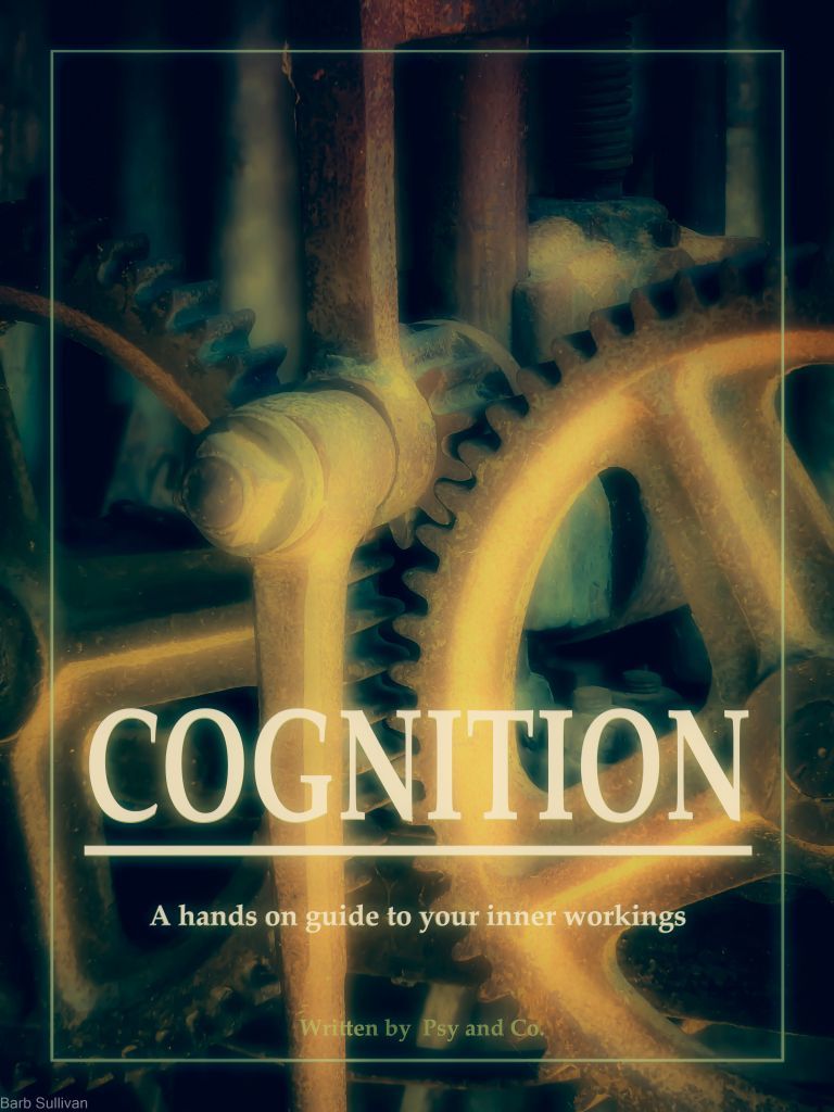
Yes, I moved the title all over the place to start with ..... Obvious place is up the top but I felt it encroached upon the junction of the gears .... perhaps removing the white boundary line may have been a better idea, allowing more space for the title.
The alternative was to have the writers more prominent ... but again the same issue.
I had all the writing in white at one stage but it seemed a bit too bright (maybe lowering opacity may have been a better option).
All part of the experimenting rollercoaster
-


Comment